The Scatter Chart Tool
You can use the tool to create scatter charts which show relationships between two properties. You can plot single or multiple data series for any property of the following objects in your solution: 2D grids, 3D grids, 3D meshes, wellbores, tri-meshes, polylines, point sets, and marker sets. You open the Scatter Chart Tool ![]() from the Charts View toolbar.
from the Charts View toolbar.
At the top of the tool you can use the toolbar to duplicate, rename, or delete your existing scatter charts.

|
Duplicates the currently selected item in the drop-down list (i.e., the active item). |

|
Opens the Rename dialog, where a new name can be given to the active item. |

|
Deletes the active item. |
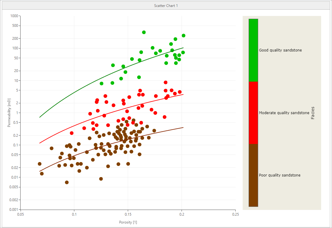
A scatter chart showing porosity versus permeability, colored by the facies property. A regression model has been applied. click to enlarge
To create a scatter chart
- Select
 Create new from the Scatter chart drop-down list. Optionally, enter the name of the scatter chart in the text field below. By default, a new scatter chart is named as 'Scatter Chart <#>'. To modify the name of an existing scatter chart use the rename button
  from the toolbar.
 - In the Data tab, if a series does not yet exist, click Add series. Use the series toolbar to manage your 'Series' table.

Adds a new series in the chart. 
Moves the selected series one step up in the table. The order in the table determines the order drawn on your chart. 
Moves the selected series one step down in the table. The order in the table determines the order drawn on your chart. Duplicates the currently selected series. 
Deletes the selected series. - On the left side of the tab, click the series name you want to provide the inputs for. The selected row is highlighted in blue. On the right side of the tab, specify the inputs and settings.
- Name Name of the series you added or selected in the table on the left. You can update the name in the text field.
- Source type Select the source type from the drop-down list. You can select from one of the following: 2D Grid, 3D Grid, 3D Mesh, Marker set, Point set, Polyline set, Tri-mesh, or Wellbore.
- Surface type Select the surface type from the drop-down list, when the source type is 2D Grid, Marker set, Point set, Polyline set or Tri-mesh.
- Folder Select the folder from the drop-down list, when the source type is 2D Grid, Marker set, Point set, Polyline set or Tri-mesh.
- Storage type Select the storage type from the drop-down list, when the source type is 3D Mesh or Tri-mesh.
- Source Select the source from the drop-down list. The drop-down list shows all sources of the selected 'source type' in your solution. If your source type is 'Wellbore', then a table is shown here, where all the wellbores in the selected wellbore group are listed. Check the wellbores for which you want to plot your data.
- X-Axis property/log type This selection acts as a filter. Select the property type from the drop-down list. If you choose 'Any...', all your properties for the selected 'Source' object will be available in the following drop-down list.
- X-Axis property/log Select the property that you want to plot from the drop-down list. If 'Any...' was chosen for the type, selecting a property here will populate the type field above with the corresponding type.
- Step Active only if the selected property has multiple realizations or time steps. Select the realization or time step from the drop-down list.
- Y-Axis property/log type This selection acts as a filter. Select the property type from the drop-down list. If you choose 'Any...', all your properties for the selected 'Source' object will be available in the following drop-down list.
- Y-Axis property/log Select the property that you want to plot from the drop-down list. If 'Any...' was chosen for the type, selecting a property here will populate the type field above with the corresponding type.
- Step Active only if the selected property has multiple realizations or time steps. Select the realization or time step from the drop-down list.
- Color property/log type This selection acts as a filter. Select the property type from the drop-down list. If you choose 'Any...', all your properties in the solution will be available in the following drop-down list.
- Color property/log Select a property that you want to use to color the data points of your series from the drop-down list. The colors used are the same as in the display of that property in a 3D or 2D view. If 'Any...' was chosen for the type, selecting a property here will populate the type field above with the corresponding type.
- Step Active only if the selected property has multiple realizations or time steps. Select the realization or time step from the drop-down list.
- Filter Adding a filter is optional. You can add a property-based filter on the selected series. You can use another property to filter the property. Click the 'Edit Filter'
 icon to open the Filter Tool. The source type selected on the Data tab is populated in the tool.
Important When you plot multiple data series in a scatter chart, they must have the same property type (for discrete properties) or quantity (for continuous properties). - Click Apply to plot the scatter chart and keep the tool open, or click OK to plot the scatter chart in the Charts View and close the tool. See Working with the charts display for an overview of chart controls.
Scatter chart tool tabs
The Scatter Chart Tool has several tabs, each with specific settings which allow you to create and modify your scatter chart. With the Data tab you specify the data for the chart, then you can use the Regression Model tab to create a regression line on the data. Use the Series and Chart Format tabs edit how your charts are displayed. Each the tab has a left and right section. On the left section you add and select a series or components and it is highlighted in blue. On the right section you change and specify the settings.
Series You can create, reorder, duplicate, or delete a series in the table. Use the checkboxes to show or hide the series on your scatter chart. Click the series name you want to provide inputs for. The selected row is highlighted in blue.
|
|
Adds a new series in the chart. |
|
|
Moves the selected series one step up in the table. The order in the table determines the order drawn on your chart. |
|
|
Moves the selected series one step down in the table. The order in the table determines the order drawn on your chart. |
|
|
Duplicates the currently selected series. |
|
|
Deletes the selected series. |
Series Definition On the right side of the tab you assign inputs and settings to the selected series.
- Name Name of the series you added or selected in the table on the left. You can update the name in the text field.
- Source type Select the source type from the drop-down list. You can select from one of the following: 2D Grid, 3D Grid, 3D Mesh, Marker set, Point set, Polyline set, Tri-mesh, or Wellbore.
- Surface type Select the surface type from the drop-down list, when the source type is 2D Grid, Marker set, Point set, Polyline set or Tri-mesh.
- Folder Select the folder from the drop-down list, when the source type is 2D Grid, Marker set, Point set, Polyline set or Tri-mesh.
- Storage type Select the storage type from the drop-down list, when the source type is 3D Mesh or Tri-mesh.
- Source Select the source from the drop-down list. The drop-down list shows all sources of the selected 'source type' in your solution. If your source type is 'Wellbore', then a table is shown here, where all the wellbores in the selected wellbore group are listed. Check the wellbores for which you want to plot your data.
- X-Axis property/log type This selection acts as a filter. Select the property type from the drop-down list. If you choose 'Any...', all your properties for the selected 'Source' object will be available in the following drop-down list.
- X-Axis property/log Select the property that you want to plot from the drop-down list. If 'Any...' was chosen for the type, selecting a property here will populate the type field above with the corresponding type.
- Step Active only if the selected property has multiple realizations or time steps. Select the realization or time step from the drop-down list.
- Y-Axis property/log type This selection acts as a filter. Select the property type from the drop-down list. If you choose 'Any...', all your properties for the selected 'Source' object will be available in the following drop-down list.
- Y-Axis property/log Select the property that you want to plot from the drop-down list. If 'Any...' was chosen for the type, selecting a property here will populate the type field above with the corresponding type.
- Step Active only if the selected property has multiple realizations or time steps. Select the realization or time step from the drop-down list.
- Color property/log type This selection acts as a filter. Select the property type from the drop-down list. If you choose 'Any...', all your properties in the solution will be available in the following drop-down list.
- Color property/log Select a property that you want to use to color the data points of your series from the drop-down list. The colors used are the same as in the display of that property in a 3D or 2D view. If 'Any...' was chosen for the type, selecting a property here will populate the type field above with the corresponding type.
- Step Active only if the selected property has multiple realizations or time steps. Select the realization or time step from the drop-down list.
- Filter Adding a filter is optional. You can add a property-based filter on the selected series. You can use another property to filter the property. Click the 'Edit Filter' icon to open the Filter Tool. The source type selected on the Data tab is populated in the tool.
On this tab you can create a regression model to display on your scatter chart. Regression models are only supported for continuous properties.
Series Click the series name you want to assign a regression model to. The selected row is highlighted in blue.
Regression Model Assign a regression model to your selected series by selecting one from the drop-down list. To create a new regression model, click the edit icon to open the Regression Model Tool. After you have created or assigned a regression model to your series, the tab updates with an overview of the specified settings:
- Name Displays the regression model assigned to your series. Select one of the options in the drop-down list. If none are available, create one with the Regression Model Tool.
- Type Displays the regression model type assigned in the Regression Model Tool. The following regression types are available: Exponential, Linear, Logarithmic, Polynomial, or Power-Law.
To visualize the regression model on the scatter chart, ensure the checkbox next to your series is checked in the 'Series' table on the Regression Model tab.
At the bottom of the Scatter Chart Tool, click Apply to plot the regression model on the scatter chart and keep the tool open, or click OK to plot the regression model on the scatter chart and close the tool.
In this tab you can format each data series of your scatter charts and regression models. On the left side of the tab select the component you want to change or format. The component is highlighted in blue and the right side updates with the relevant settings.
To reset all the series format settings to their defaults, click the ![]() icon.
icon.
Points Displayed You can choose between two options:
- Maximum number Enter the number of points you want to display out of the total.
- Fraction Enter a number between 0 and 100%. To display the fraction in numbers, right-mouse click on the percent symbol to change the quantity to 1. The fraction or percentage number of points are displayed in the fields to the right.
Points Format
- Color To change the color of the points, select a color from the drop-down list. This option is inactive if you have selected a color property type in 'Series Definition' on the Data tab.
- Style To change the point style, select a style from the drop-down list.
- Size To change the point size, enter a number in the field or change the number with the up or down arrow buttons.
Regression Model Format
- Color To change the color of the line, select a color from the drop-down list.
- Thickness To change the line thickness, enter a number in the field or change the number with the up or down arrow buttons.
Click Apply after setting your options.
In this tab you can format the chart Axes, Title and Legend. On the left side of the tab select the component you want to change or format. The component is highlighted in blue and the right side updates with the relevant settings.
Axes You can adjust the scale, axis range, and title of your axis.
- Axis Select the axis you want to format from the drop-down list. The Y-Axis is not available for histograms.
- Scale Select Linear or Logarithmic.
- Reverse Only available for scatter charts. Use the checkbox to reverse how the axis is displayed (low to high or high to low).
- Axis range The starting and ending points for the axis. By default the Same as bin range checkbox (for histograms) is checked, meaning the that the minimum and maximum of the axis is taken from the bin range. By default the Auto checkbox (for scatter charts) is checked, meaning that the minimum and maximum of the axis is taken from the series values. To enter the range manually, uncheck the checkbox. Enter the Minimum and Maximum values in the fields below.
- Title Change the visibility and text of your axis title.
- Visible Use the checkbox to show or hide the axis title.
- Same as property type To customize your axis title, uncheck the checkbox. Enter your text in the text field.
Title You can edit and format the title of your chart.
- Visible Use the checkbox to show or hide the chart title. The chart must be visible to access the color and font settings.
- Same as chart name To customize you chart title, uncheck the checkbox. Enter your text in the text field.
- Color To change the color of the chart title, select a color from the drop-down list.
- Font Click Font... to open a dialog where you can specify which font, style and size to use for the title.
Legend You can format your legends and their locations on the chart.
- Legend You can format the main legend of the chart.
- Visible Use the checkbox to show or hide the legend on the chart.
- Location To change the legend location on the chart, select a location from the drop-down list.
- Color property Legend You can format the legend of a color property if selected in the Data tab.
- Visible Use the checkbox to show or hide the color property legend on the chart.
- Location To change the legend location of the color property on the chart, select a location from the drop-down list.
- Appearance You can format the text and background options of your legend.
- Text color To change the color of the legend text, select a color from the drop-down list.
- Font Click Font... to open a dialog where you can specify which font, style and size to use for the legend.
- Background color To change the background color of the legend, select a color from the drop-down list.
- Show border Use the checkbox to show or hide a line border around your legend.
Working with the charts display
When you have plotted a chart in the Charts View, there are various controls on how to display the data.
- Maximizing a single chart - When there are multiple charts in the view, click on the pop out icon
 to maximize the size of the selected chart. To return to the original size, click on the pop in icon
  .
. - Changing units - A right mouse button click on the axes opens a context menu. You can change the units by making a selection from the options provided to you. In histogram plots, the unit of the vertical axis cannot be changed.
- Zooming - In the plot area, left mouse button click and keep pressed down to activate zooming. You can move your mouse in any direction. A preview window indicates the new display window. When you let go of the left mouse button, this is the part of the chart that is shown. To zoom out, double click in the chart area. The Reset Zoom option is also available in the context menu that opens when you click the right mouse button in the chart.
- Zooming along axes - To zoom along only one axis, hover near the edges of the vertical or horizontal axis with your mouse until the tool tip changes into a bidirectional arrow. Left mouse button click and keep pressed down while moving the mouse will zoom the selected axis relative to the other axis. Additionally, to zoom along both the axes together, hover near the corners of both the axes until the tool tip changes into a bidirectional arrow at a 45 degree orientation. Left mouse button click and keep pressed down while moving the mouse will zoom both axes. To reset the layout, double click in the chart area.
- Scroll axis relative to other axis - Hover over the center of the vertical or horizontal axis with your mouse until the tool tip changes into a bidirectional arrow. Left mouse button click and keep pressed down while moving the mouse will scroll the selected axis relative to the other axis. To reset the layout, double click in the chart area.
- Show/hide legend - When the legend is shown, you can also use it as a display filter: when you click on a name, that data is hidden from the chart, and the legend is grayed out. To show the data again, click on the grayed out name in the legend.
Context menu for scatter charts
Right-mouse click on a scatter chart to open the context menu with the following options:
| Opens the Histogram Tool. | |
| |
Opens the Regression Model tab on the Scatter Chart Tool. |
| |
Opens the Chart Format tab on the Histogram Tool. |
 Statistics Report... Statistics Report...
|
Opens the Scatter Chart Statistics Report. |
| |
Copies the image to the clipboard which you can then paste in other applications. |
| Remove from View | Removes the histogram from the charts view. |
| Clear all zoom changes. |